Overview
Goodreads is an online community for readers, writers, reviewers, and bookworms of all types. Started back in 2006, Goodreads is now one of the world’s most popular and complete repository of books with 90 million registered users as of July 2019.
While the iOS app for Goodreads has gotten rave reviews, the same cannot be said for the app’s Android version. Many users have complained that the app lacks the full functionality of its desktop counterpart and that the interface is frustrating and non-intuitive. As a user of Goodreads myself, I decided to take this opportunity to see how the Android app could be redesigned.
User Research
Demographics
Based on the audience data of this app use assessment, I gained some interesting insights into the global demographic of Android Goodreads app users:
- users showed high browsing interest in college and university subjects, which can mean that the sizeable chunk of the audience attends college or is interested in attending college
- users were twice as interested in relationship topics compared to “family & parenting” topics, which indicates they are probably younger with little to no dependants
- users showed little to no interest in automobile, real-estate, or travelling, which re-inforces the idea that the majority of users are high school or college-age students who are not looking to make any major purchases or investments in the near future
- Android app users seemed to skew slightly more male compared to iOS and desktop users of Goodreads
- The app seems to appeal most to young millennials (mostly women) between the ages of 18-30 and then between older users (mostly men) from ages 40-65+, which might indicate the different stages of life that people increase their reading habits
User Reviews
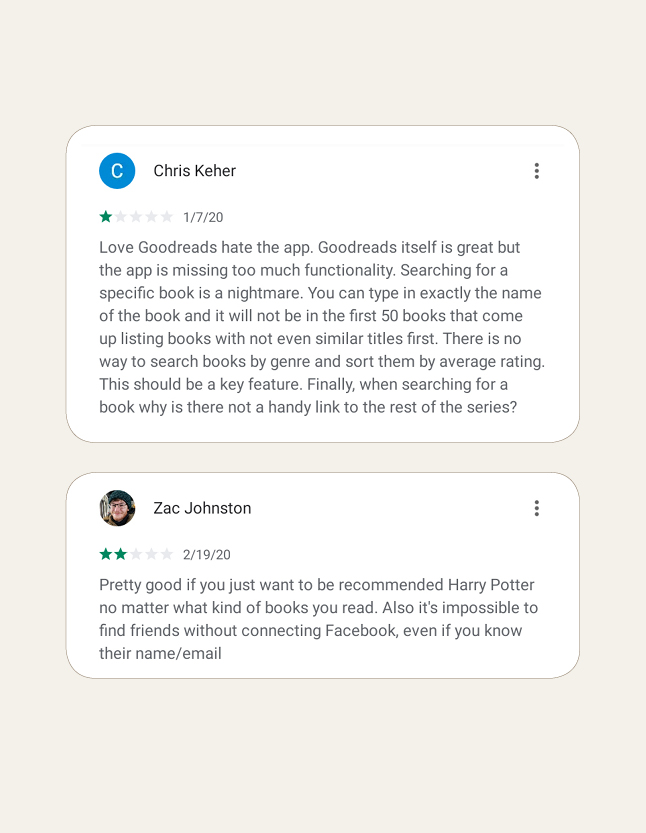
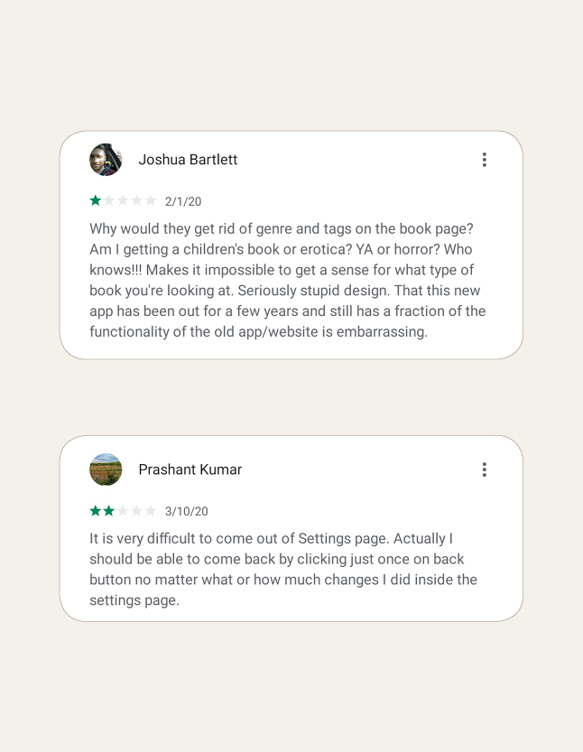
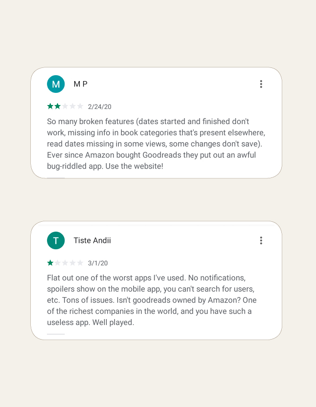
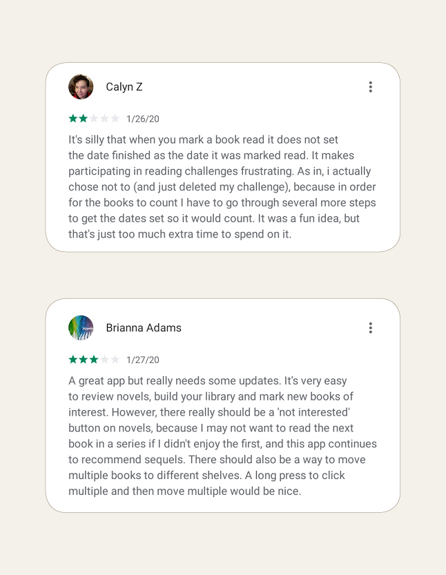
Users of the Android app left many critical reviews on the Google Play store. Some of the most common issues were repeated in many reviews and a sample of the more critical reviews are displayed in the gallery below:
Separating out common issues into categories yields the following:
|| Community Features
- Users cannot participate in group discussions, book clubs, or reading challenges
- Users cannot add friends by username and can only add existing friends from linked Facebook accounts
- The main home/social feed shows updates from everyone and lacks the desktop functionality that allows users to filter by friends or people they follow
|| Usability
- Recommendations cannot be dismissed and keep harassing the user
- Book pages lack genre tags and categories that would help users decide whether they are interested in a book and also would help with search filters
- Book reviews cannot be filtered by rating, edition, or post date
- The ad placement on book pages is particularly egregious as it sits right above the Amazon and Kindle buy buttons and often gets misclicked by users
- Users cannot add their reading start and end dates to books they’ve read
- User lists cannot be saved
Analysis
| Pain Points
- Lack of Full Functionality: Many of the functions users expected or were critical about were present and functional in the desktop site or iPhone app. A portion of the users complained that the app doesn’t have enough features to justify using it over the desktop site
- Missing or Sub-optimal Social Features: Goodreads is not primarily a social networking site, however, there are many social features on the desktop version that allow users to follow their favourite authors or reviewers and participate in various book clubs and discussions. Without this added functionality, the social features of the Android app loses its purpose. The home feed is frequently clogged with news from everyone the user is friends with instead of a curated list of updates from authors, reviewers, and friends the user follows. This streamlined feed kickstarts a number of potential user actions that are lost in the Android app:
- Exposes the users to what other similar readers in their network are reading
- Allows the user to read reviews by users whose opinions they trust and helps them decide whether a certain book is worth reading or not
- Allows users to view their close friend’s activity, such as comments on reviews or posts in discussion groups and be inspired to participate
- Limited Book Actions: Despite the app being for readers & reviewers, the app functions related to books is one of the most limited. Users cannot add a new book to any shelf other than the “Want to Read”, whereas the desktop site has a “Currently Reading” and “Read” option, along with custom user-created shelves. The function to add reading dates to a book a user has read or to add periodic status updates or notes on their progress is not available
- Non-Intuitive UI: The navigation system is confusing and certain buttons don’t do what users expect them to do. The FAB contains a pop-out of actions that not many users would use (Explore, Search Books, Scan Book Cover) because these same actions already exist in the top navigation bar. In addition, the FAB only appears on the “My Books” tab when it could be more efficient on the “Updates” tab. Other actions are hidden and hard to find, such as adding status updates or the ability to search books by genre (You would have to click on the “Explore” button on the FAB while you are in the “My Books” tab in order to have access to it instead of simply using the persistent search bar in the top navbar). Some of the most recent reviews complained about missing features that weren’t actually missing at all. However, bad UI decisions made them hard to find and/or frustrating to use effectively.
Requirements
- Improved Book Actions: Users are able to perform all the actions they do on the desktop site, which will greatly improve their app experience
- Improved Search: Users will be able filter their searches by tags, genres, or other relevant categories
- Focused Social Features: Users will only get the updates that matter to them. Discussion groups can greatly help users feel like they are able to participate and engage with other users
- Intuitive UI: Users can navigate and perform actions in the app quickly and intuitively. The interface effectively becomes “invisible” to the user as they engage with their reading community, find their favourite books, or do their favourite Goodreads activities.
- Improved Discoverability: Users are able to find new content and trending books without having to navigate through featured content they may not be interested in.
User Personas
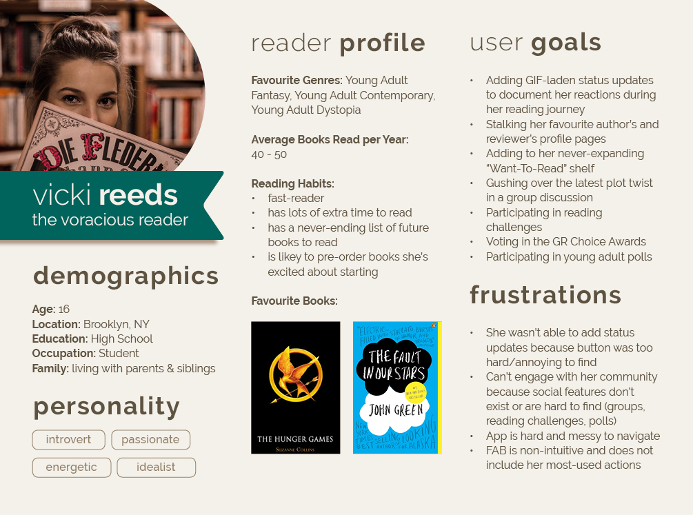
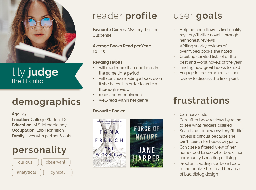
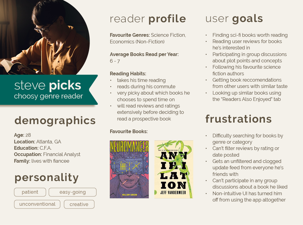
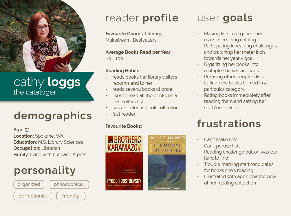
Based on the previous critical reviews and analyzing the ways in which different users engage with the app, a few user personas were developed with different app objectives and priorities.
Design
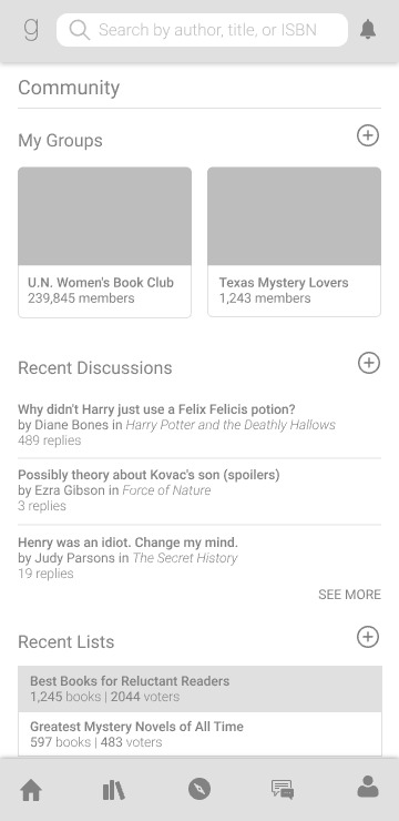
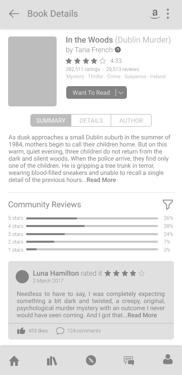
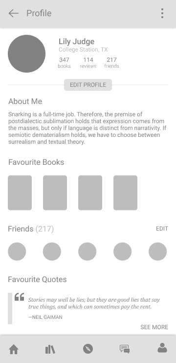
I started off the initial design process with a series of low-fidelity mockups. This helped take the focus away from colours and aesthetics and more on the navigation and content placement of the app. Many users complained about not being able to find certain functions or having specific functions that were difficult to use mainly because the navigation was non-intuitive. I kept this complain as a central focus for each screen. In addition, I knew the app would have to expand the functionality for social features. This became encapsulated in a “Community” section that users could navigate to.
Low-Fidelity Wireframes
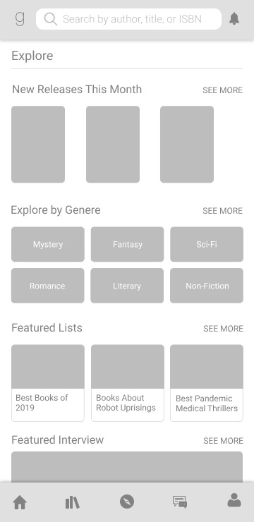
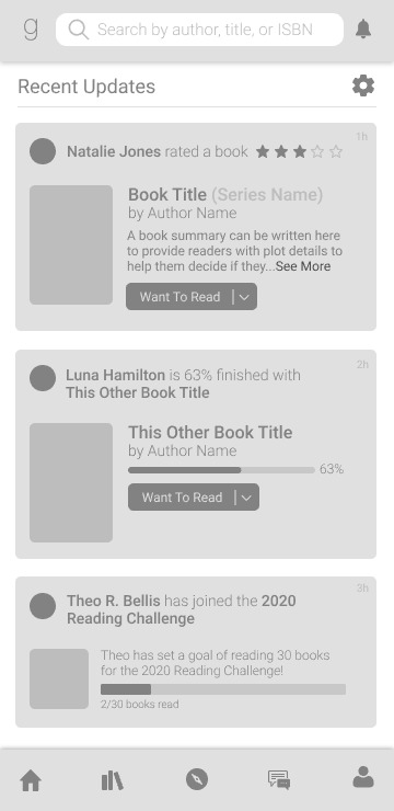
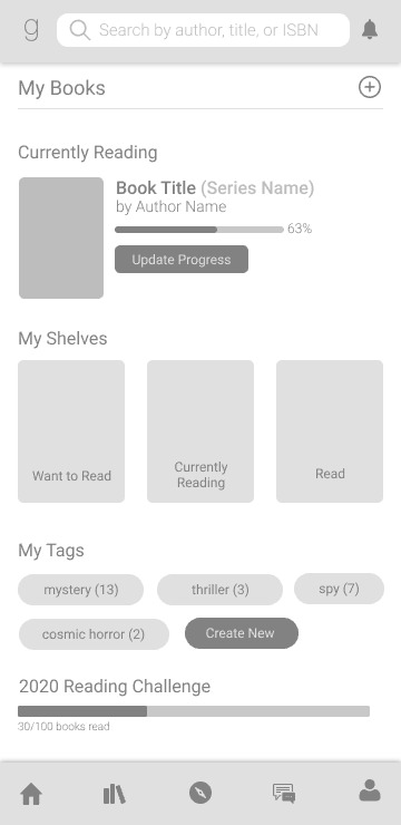
Based on the the identified pain points and selected requirements, low-fidelity mockups were made. The original Android app had a strange navigation system so the improved mockups kept the primary user destinations on a bottom navigation bar while the search function and notifications were kept to the top.
Development
As the project progressed, changes were made from the low-fidelity wireframes to the high-fidelity version.
Explore
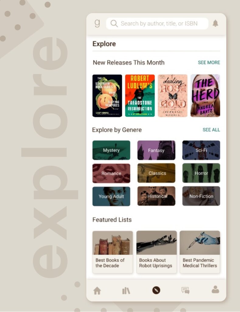
The app now contains a more easily accessible “explore” section that can be accessed by the bottom toolbar. This area allows users to discover newly released books they might be interested in, includes a genre explorer, and featured content such as lists and interviews that makes it easier for them to engage with the wider Goodreads community.
A common user complaint was difficulty finding (and searching) books by category. Users often mentioned there wasn’t an intuitive way to discover or stumble upon new content like the desktop version unless this content somehow popped up on their news dashboard. However, as we will address in a later section, the app’s news dashboard had its own issues and was often clogged with irrelevant items. An “explore” feature does exist on the current Android app, however, some users never even realized it existed because of the confusing navigation.
Home Feed
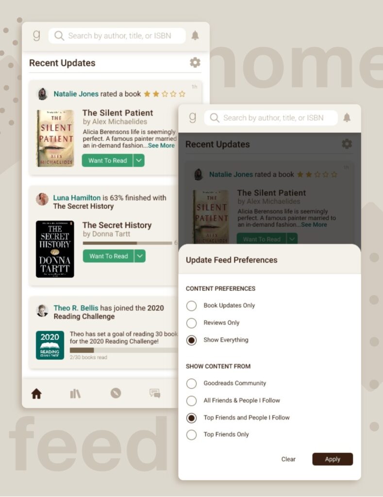
To resolve the issues of a clogged home dashboard feed, users can now set their preferences to who they would like to follow and what sorts of content they want to see. This allows for a more curated user experience where readers can engage more fully only to the content they want to subscribe to. Lily (our reviewer persona) can adjust her feed to show her content from other reviewers and keep herself updated on what books her community is discussing. Meanwhile, Steven (our picky genre reader) can instead set his preferences so he’s only seeing content from the select reviewers and readers he follows and trusts, allowing him to discover books he’d be interested in reading instead of slogging through an endless feed of irrelevant updates.
Community
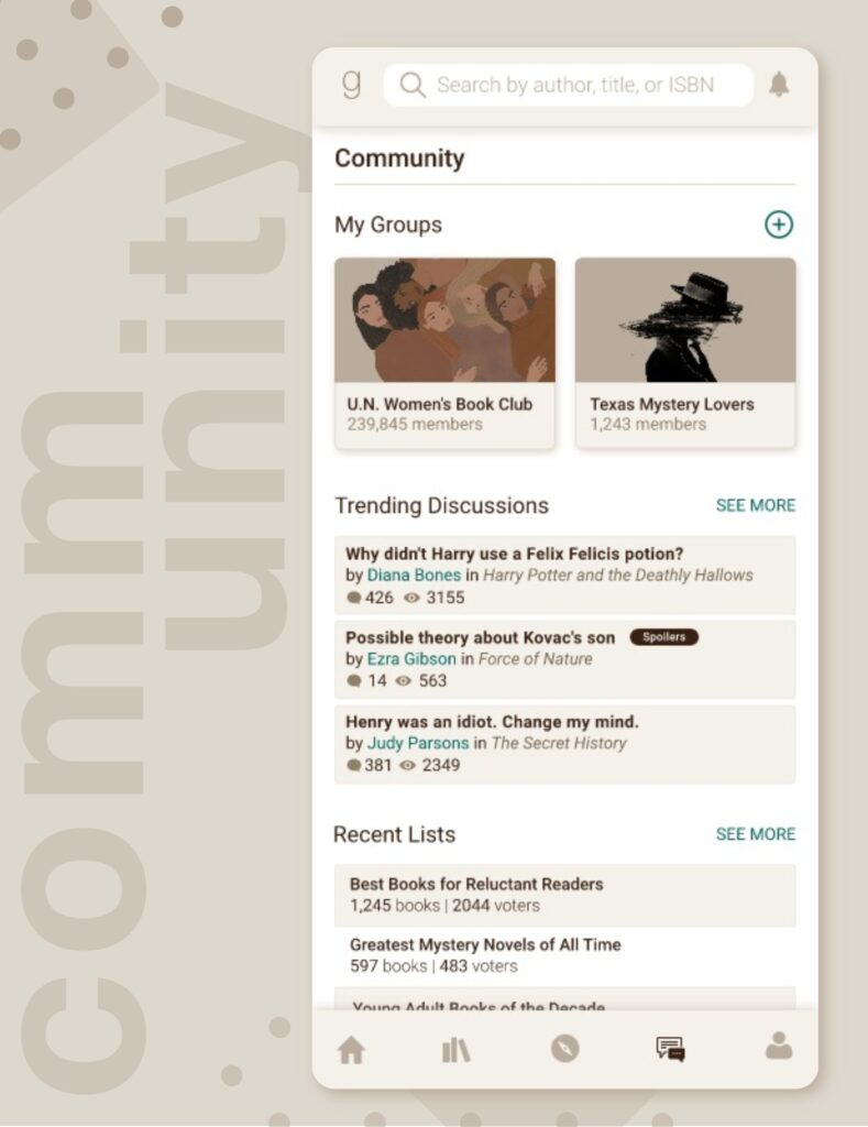
On the desktop version of Goodreads, user-generated lists, book discussion threads, and common interest groups form the backbone of much of the social aspects of the user experience. While it is possible to use the site without ever engaging with the greater Goodreads userbase, more social-oriented users lamented the loss of these social features in the Android app.
As different user personas are attracted to different social aspects (i.e. Lily the reviewer may be partial to discussion groups whereas Cathy the cataloger prefers to peruse endless lists to inspire ideas for her own), most of the social features were group together under the Community section where users can quickly scan an overview of activity that’s trending in their social spheres.
Users who have joined groups can quickly access them from this community dashboard instead of searching them up. The featured discussions are pulled from books the user has recently marked as “Read” or discussion boards they have already posted and frequented. This keeps the discussion topics unique to the user’s interests instead of bombarding them with endless irrelevant content. As the main Explore tab contains all the featured content (including featured lists curated by Goodreads admins), the community tab provides a space for discovering new and recent lists.
My Books
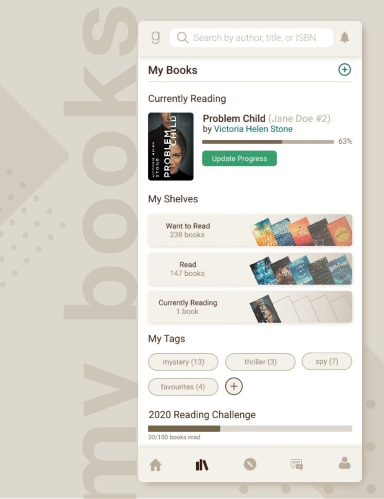
The users also needed a central page to act as a library of all their shelves and reading updates. The current Android app put the “My Books” section as a secondary tab on the home page. There was also a FAB that contained additional functions that weren’t necessarily related (Scanning book covers, a link to the “Explore” section, and links to “Recommended” books that seemed like non-intuitive placement.
Usually, readers navigated to the “My Books” section simply to update their progress on their currently reading books or to peruse their “Want to Read” shelf for more reading ideas. Therefore, these were given more prominence in the new design. New tags for shelves could be added more intuitively instead of taking a circuitous path through an FAB. This page also proved to be an ideal placement of the user’s reading challenge, should they choose to participate.
User Profile
The main user profile is a place to access all sorts of content such as user bios, friend lists, favourite quotes, or the most recent user activity. Since this is a central hub for a wide variety of content, the new profile page has tabs organizing and separating relevant items. Since Goodreads has a lot of content users can “favourite” or “like”, the “Favourites” tab provides a comprehensive view of all the lists, books, genres, or quotes that the user has collected over the life of their account. This content was usually spread sporadically over the app (and desktop version) so this system centralizes it and makes it more intuitive to manage.
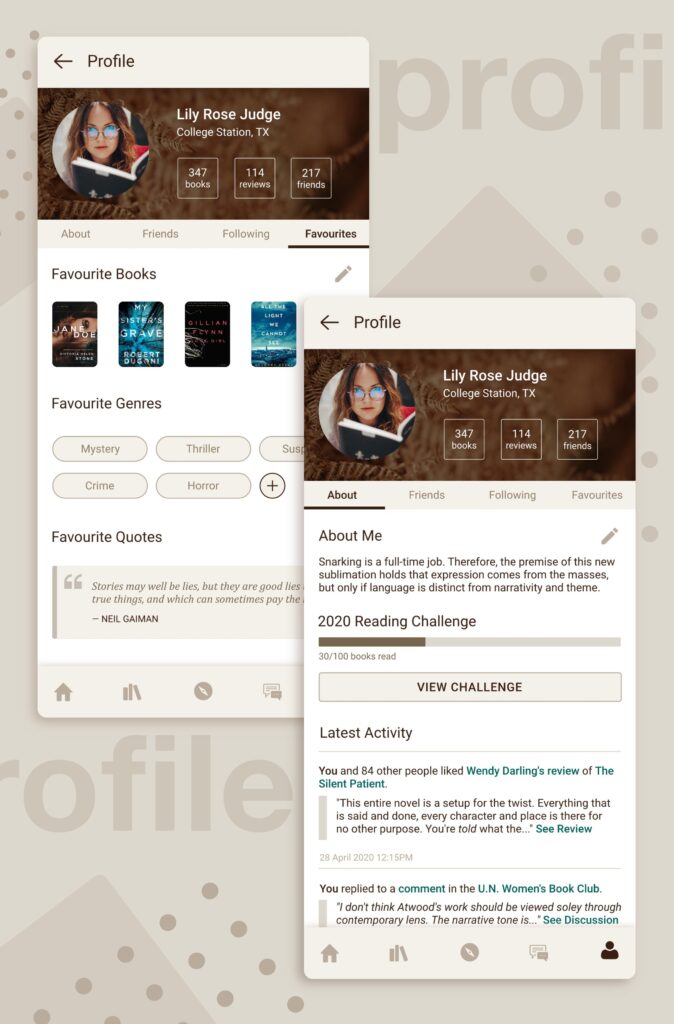
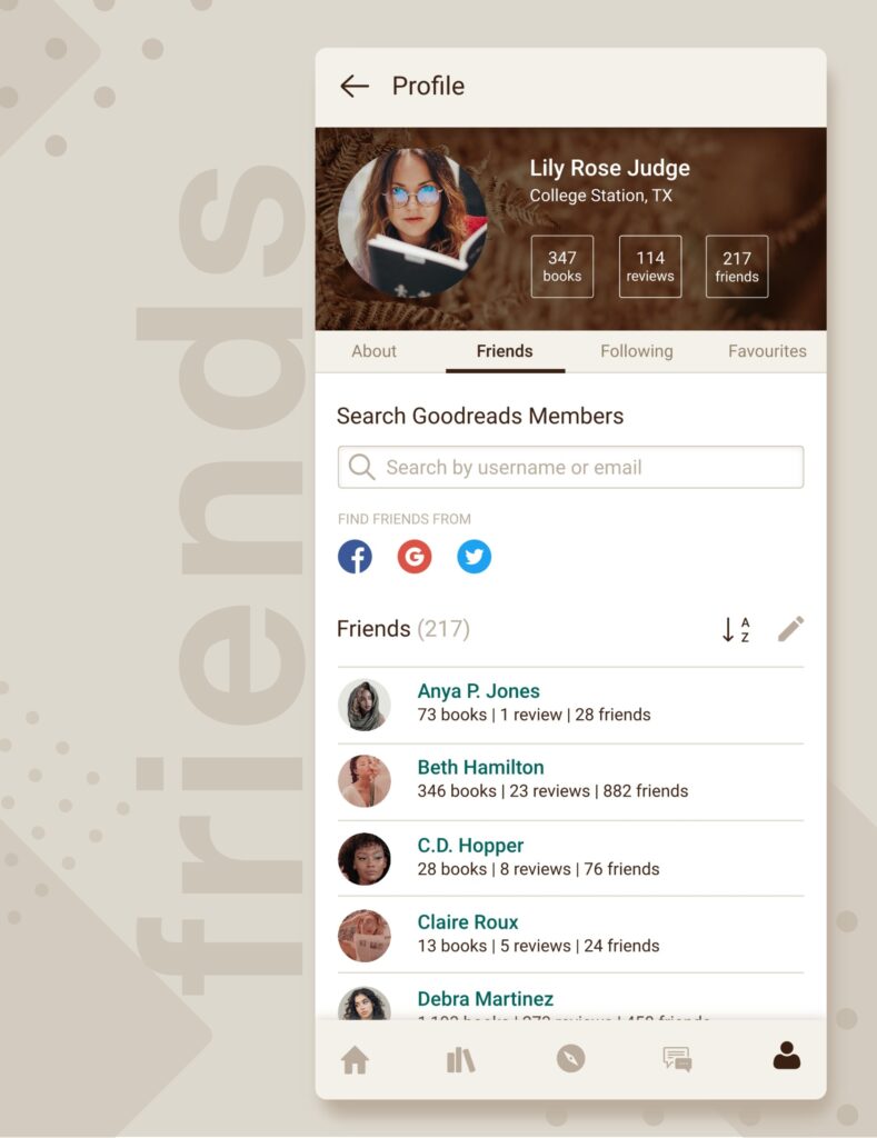
The “Friends” tab now allows users to search for friends by username, email, or by linking their social media accounts. This was an oft-repeated complaint as users were only able to add friends if they knew them on Facebook instead of searching them up by username if they didn’t want to link accounts.
Search
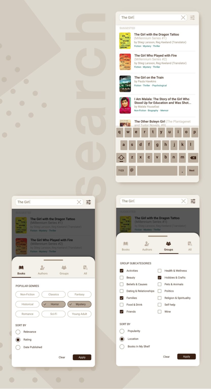
The desktop options of filtering and narrowing search categories was added to the search function. Users are able to select their search categories between books, authors, and groups in order to focus their queries. Each book also has genre tags so users can differentiate between similar titles, or exclude certain genres in their query.
Groups can also be searched for based on their main category and can be sorted by location if the user wants to join a local group.
Book Details
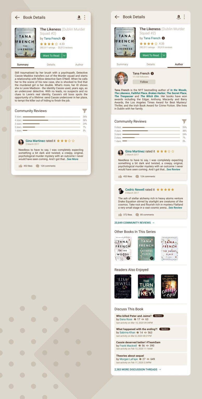
The main book details page was given a massive overhaul. The community reviews can be filtered by rating or date posted. The e-book purchasing options have been moved so they wouldn’t interact with ad placement. The layout has been updated to make it easier for the reader to parse different sections of content. Discussion threads related to the book have also been added.
Prototype
A clickable prototype can be viewed here.
Constraints
As this was simply a case study, there were a few constraints that stopped this project from being explored in other directions. Many of the complaints surrounded functional issues that would require an Android developer’s attention (app crashes, broken buttons, long load times, etc). Fixing those kinds of issues is beyond the scope of this study, however they would greatly impact the user experience and app satisfaction.
As I did not have access to any regular Goodreads app users of a reasonable size to sample from, testing and validation was minimal. A larger testing process would be needed before validating any of these designs.
When implementing the design, I had the reviewer persona in my forefront more than any other user persona. Therefore, most of the design revolves around the discussion boards and review sections of the app even though other personas may spend more time on things such as list creation.
Goodreads also has different sorts of accounts for readers, authors, and “librarians” (user accounts upgraded with certain admin privileges). These accounts would likely different kinds of functionality like adding new books to the Goodreads database, editing details, or moderating discussion boards. However, exploring these alternate user experiences was also beyond the scope of this study.
Retrospective
Looking back over the states of this case study, there are certainly areas of improvement and unexplored avenues. For example, avid ebook readers will often sync thier Kindle updates, notes, progress, and highlights to their Goodreads account. This functionality has not been explored in this study, but it would provide a seamless way for readers to switch between reading and immediately engaging with the wider community of other users reading the same book, or even are on the same page.
More user feedback would be also required before attempting further iterations or refinements. Over the course of reading through user reviews and poking around the current Android app myself, I learned just how important an intuitive UI is. It helped me gain a greater appreciation for how good apps gently guide users instead of trapping them in a frustrating maze of bizarre options. This is something I hope to carry in mind with future implementations.
