Overview
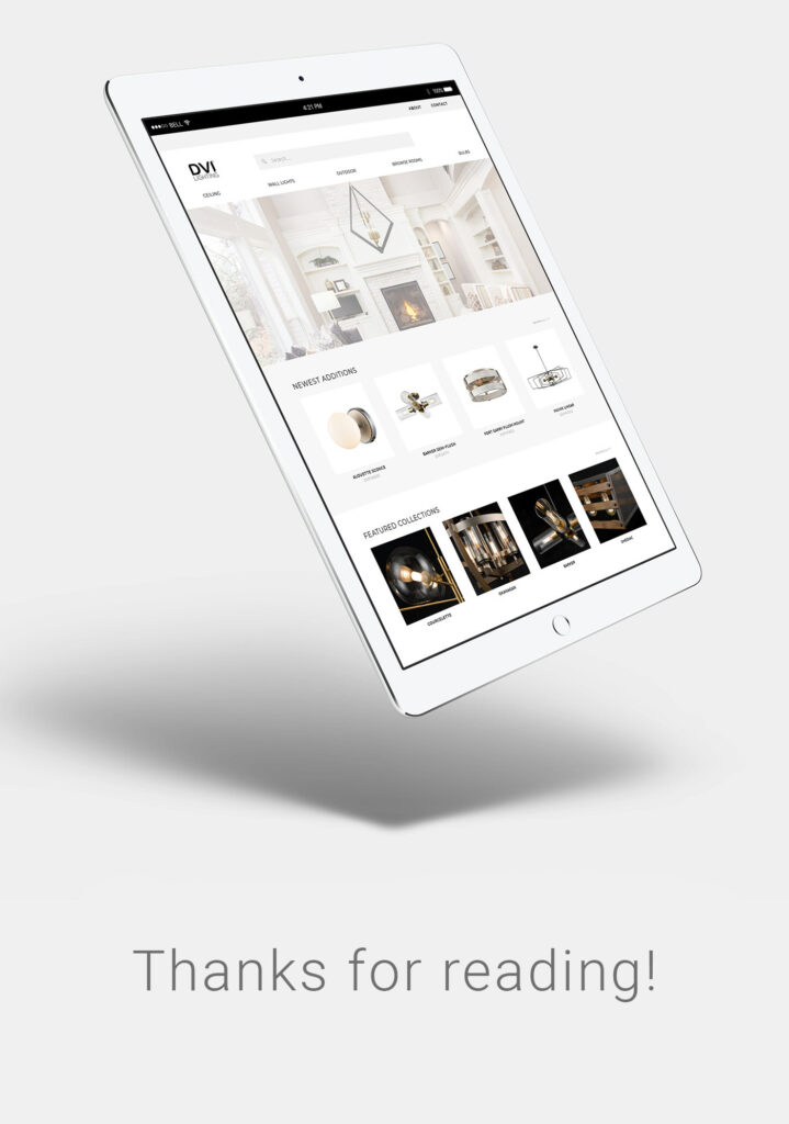
DVI Lighting wanted to give a fresh & functional look to their website. As mainly a business-to-business facing company, the website had to cater to a variety of lighting industry experts: showroom owners, lighting retailers, building contractors, and customer sales representatives. Occasionally the website was frequented by new homeowners and customers looking to renovate their outdated light fixtures. The website had also evolved to become a pivotal data repository for employees looking up their own products.
Accessing accurate and reliable data was crucial. The site needed to include the latest collection of available products and provide resources such as technical specification sheets, assembly instructions, and physical dimensions for the diverse user groups who needed information for their projects.
By revamping the site, the design team and I hoped to vastly improve the online experience for all users by making it effortless and efficient for them to get the information they needed.
Problem Statement
Background
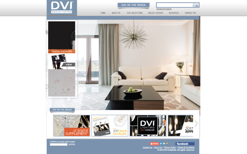
DVI Lighting once had an outdated, yet mostly reliable, website. The aesthetics were stuck in 2003 and it was not mobile friendly. In order to catch up to their competitors, a brand new website was commissioned to a 3rd party developer. This new website looked fancy but was deployed in a rush without proper testing. Despite the overall modern facade, it was a disaster under the hood.
pain points
Navigation & Site Flow:
- Bulky navigation
- Duplicate navigation links
- Pointless pages
- Current products not found
- No technical sheets found
- Products must be searched into search bar to be found instead of navigating
Data Reliability:
- Inaccurate data
- Incomplete data
- Outdated & discontinued products displayed.
- Wrong image shown.
- Product data missing.
- Incomplete list of products.
- Measurement data in wrong units
Visual Design:
- Bad typography
- Paragraph line-heights too small
- No branding colours.
- No image optimization
- No image resizing standards
- Cluttered interface
- Lack of cohesive visual direction
- Poor use of space.
- Outdated design
Interactivity:
- Not mobile-responsive
- Broken links
- Broken features
- Broken APIs
- Navigation bar glitches on page load
- Site takes too long to load
Constraints
The different contraints placed on this project fell into a few different catagories.
resource constraints
The team was small and not every member could be 100% dedicated to the project as they had other responsibilities. Our contracted developer was on a limited time frame as he had upcoming projects after the summer. Therefore, they couldn’t commit to vastly different mobile and desktop experiences in the time frame. Both the navigation system and navigation tree would have to be virtually identical for the sake of time for implementation and testing.
technical constraints
We had no official database to work off of. All relevant website data had to be collected and organized from scratch from various departments and repositories. The look and feel of the website had to be similar in style to another failed website redesign (outsourced) that the user base was already familiar with for the sake of consistency.
budget constraints
The budget was limited. A substantial chunk of the budget had already been sunk into a previous outsourced redesign attempt no one was happy with. We couldn’t afford eye-tracking software or a dedicated team of designers to work on this project full-time. Because of the time constraints of the complicated history of previous attempts at a website redesign (outsourced), we had a little over 10 weeks to complete this project.
User Research
user surveys
An initial website survey was crafted by the team. Questions pertained to what the users wanted the site to do for them, what they found frustrating (divided into categories like Navigation or Data Accuracy), and features or content they’d like to see that could help them with their online experience.
At this time, we did not have direct access to the user base and were discouraged from communicating with them until a more solid website could be offered as a peace offering. Therefore, Customer Service was an invaluable resource into common user complaints. We met with them to have an open invitation to air their most commonly heard issues and later categorized them to see where their users were most frustrated so we could focus our energy there. We also met with the Sales team who knew the regional customers and their complaints best and sent them a version of the questionnaire they could send to their sales representatives and showroom owners. We also took an inventory of the verbal and written complaints they had received over the months.
From my perspective, the main overarching problem for users was the inability of various users to access accurate product information quickly and intuitively. Convoluted navigation trees, missing products, inaccurate technical specifications, and a badly designed mobile site led to users either unable to find what they were looking for or finding bad data instead. There were certainly different types of users but the current website catered to absolutely none of them. There was also a serious lack of trust among some of the users who had been let down. How could they trust the website data when so much of it was missing or just plain wrong?
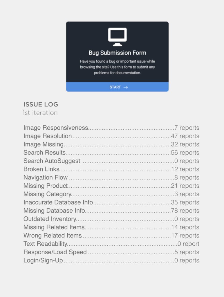
site metric analysis
Quantitative data was needed on the users based on their activity on the current site. We tracked things like which products had the highest page views, the average time spent on certain pages, and if there were sections of the site that hardly got any traffic. Much of the conclusions drawn based on this data had to be interpreted through user survey answers since we had limited click-through tests and couldn’t afford expensive eye-tracking software. Some pages were not visited because a certain user group was not interested in that particular content (i.e. the News and Events pages had little activity) and other pages had infrequent visitors because it was hard for users to find and they were surprised that such content existed when prompted (i.e. due to some confusing navigation layouts, users were unlikely to stumble across outdoor lighting fixtures as a category). No concrete recommendations on changes were made at this stage; it was about cataloging common complaints and putting them into relevant categories. We also opened the floor for features they’d like to see that would make their online experience better but some of those items were “wishlist” items for the ideal-scenario and others were practical elements we could implement given our constraints.
contextual inquiry
In addition to long-time customer users, we also had in-house employee users. Both groups were active site users but used the site in different ways. For this reasons, we knew it would be important to create different user personas that addressed the needs and frustrations each user group had. We met with the heads of each department to get some insight into how they used the site and sat with them as they navigated the site in real-time and talked about their thought process and obstacles. Based on these exercises and the insight gathered from the Customer Service and Sales teams, creating usergroup-specific task flows became a central focus for moving forward with future wireframes, interfaces, and prototype decisions. However, we would need a better navigation system than the existing one to ask users to perform tasks on. Given the different user groups, we knew the eventual navigation system would have to be a compromise but it would be incredibly insightful and useful to understand why certain users grouped certain topics the way they did.

persona creation
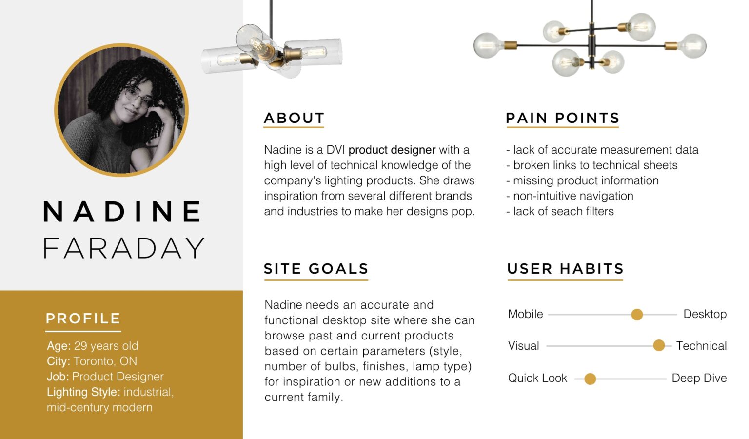
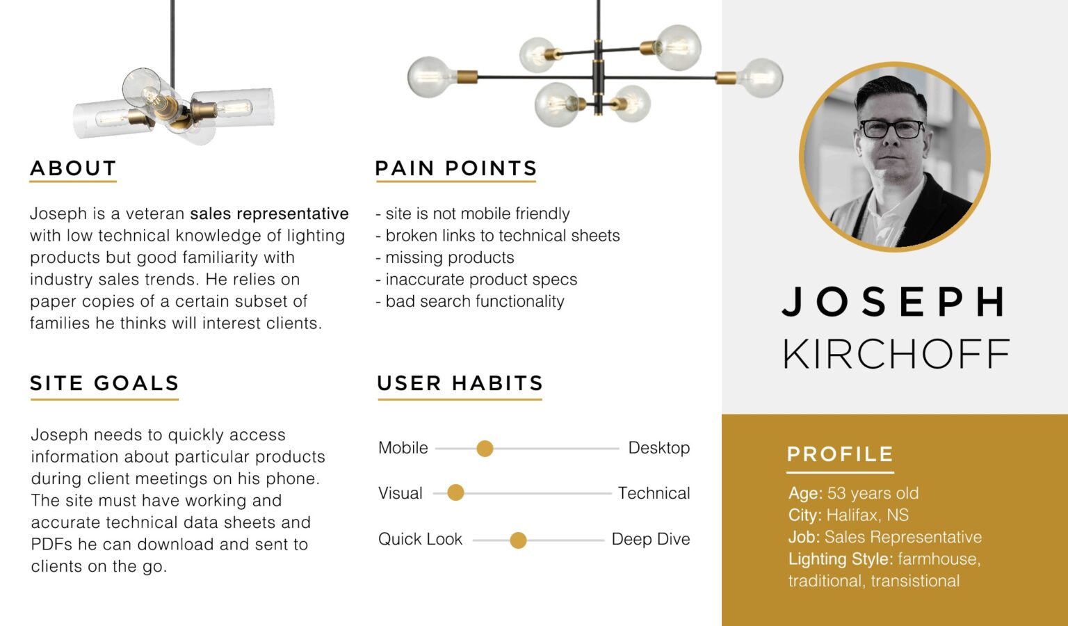
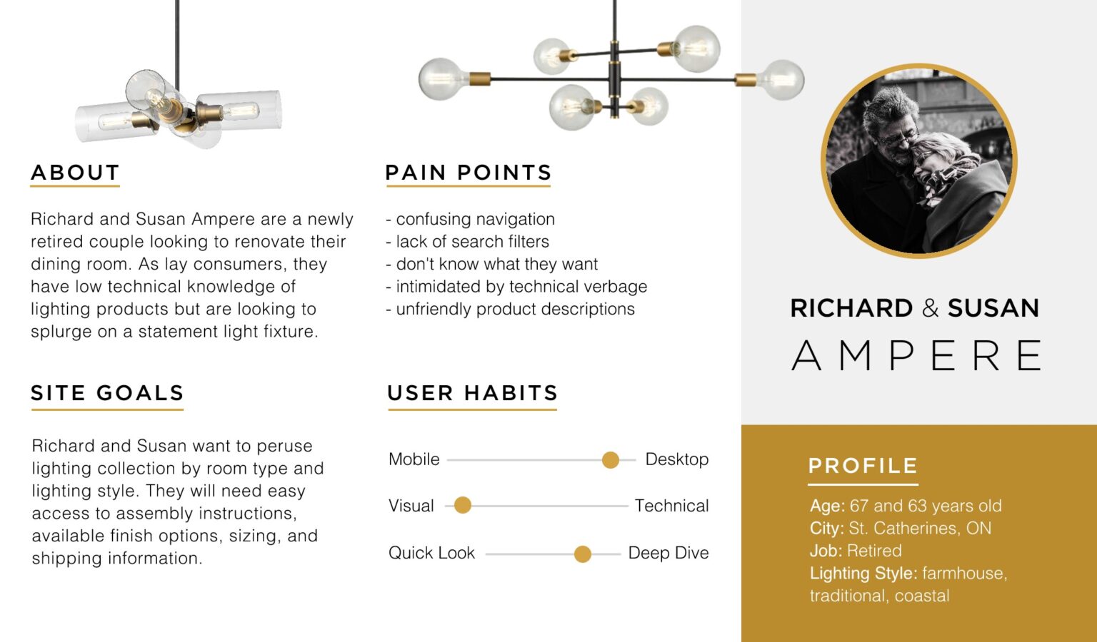
Who are the users, anyway? The proposed website would be a frequent bookmark for a diverse collection of personas for end-users. They ranged from high technical backgrounds to casual shoppers. Their objectives for how they were going to use the site and what information they were looking for was also varied. To keep these desires in mind, we assembled four different personas based on the common clusters of user-types that made up our site audience.
Once we had a sizeable amount of qualitative data to work off of, personas were created to divide the user base into common groups. We wanted to know: “Who are our users?”, “What features does user X use the most?”, “What sort of information is user Y looking for?”, “What kind of navigation system would be optimal for user Z? How would that impact users X and Y?”
card sorting
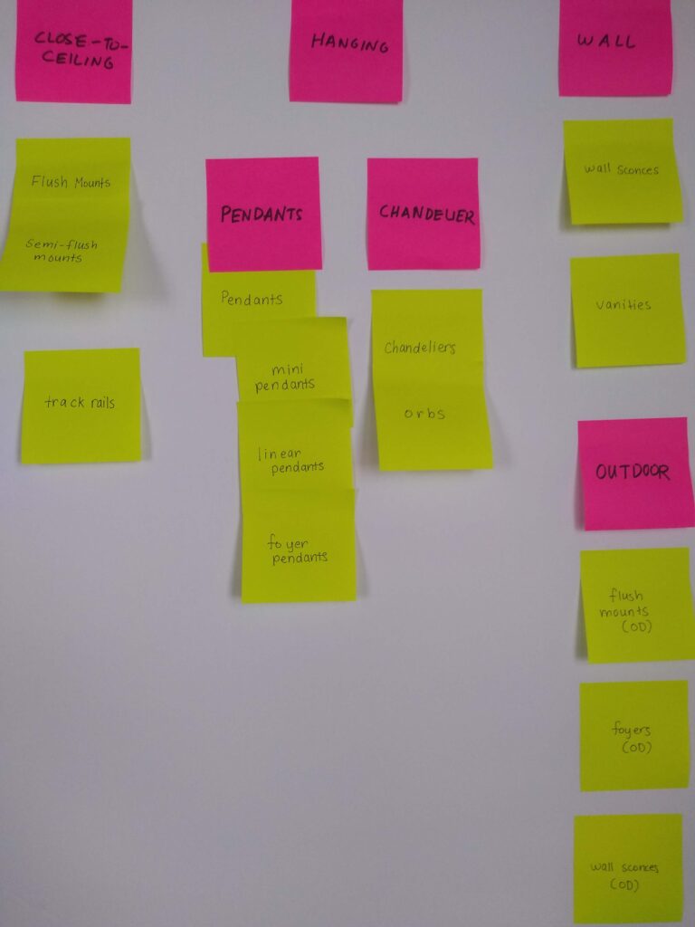
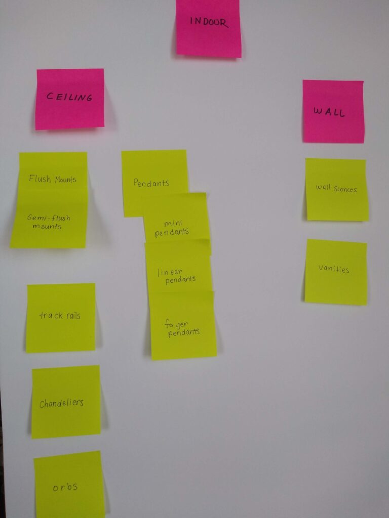
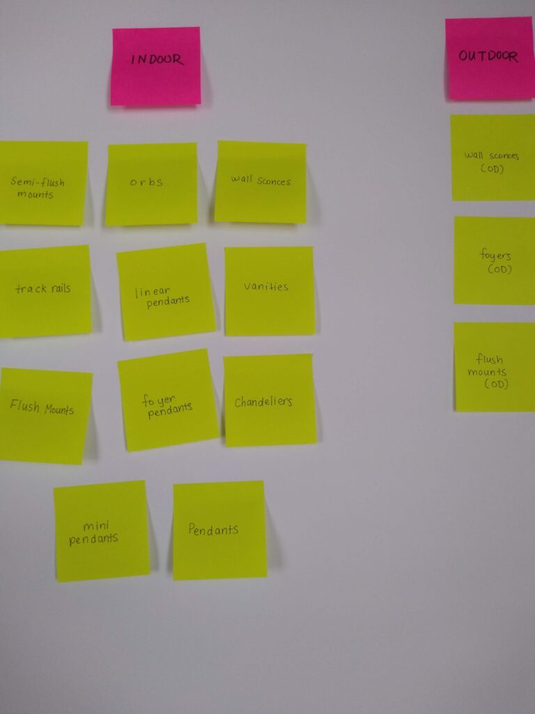
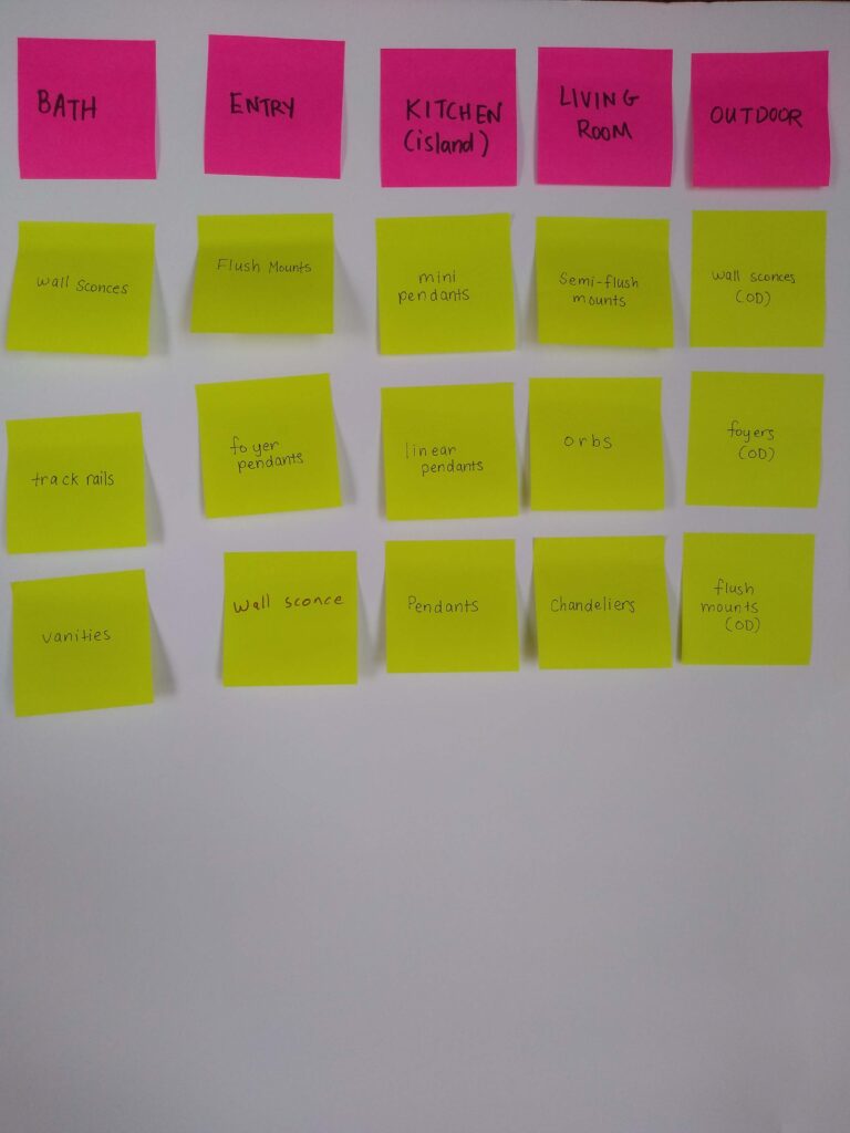
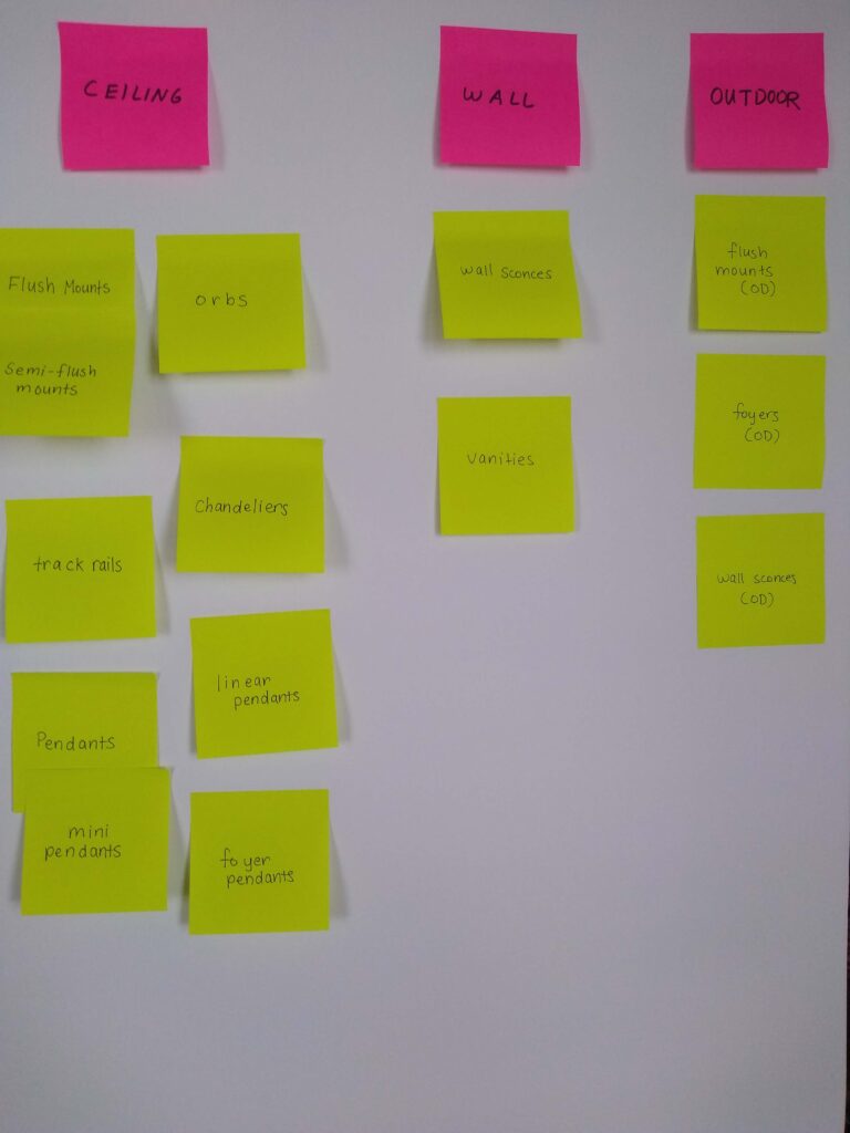
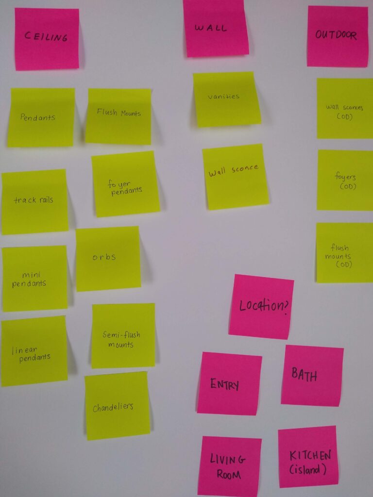
Since navigation was an important issue to get clarity on, card sorting was conducted for a sample of each user group to determine how best the products and categories should be arranged. Originally an open card sort was conducted where the users were encouraged to create their own categories, but this was too chaotic. Instead, a list of higher level cards (in red) and lower level cards (in fluorescent yellow) were used to provide a more dynamic system of organization. As seen in the gallery below, there were a lot of different ways each group saw the division of categories.
Design
Initial Sketches
Our graphic designer had already created sample wireframes from a previous attempt at the project from a few years ago. Though they were aesthetically pleasing, we had to re-asses the user flow and existing sitemap given our new research information.
I took a look at some of our competitor sites to see how they prioritized their information. I made several sketches for each page type depending on the type of user that would be perusing our site. It was difficult to find a balance between the lighting-expert users and laypeople with no background. Below are some initial sketches that were proposed for the Home page.
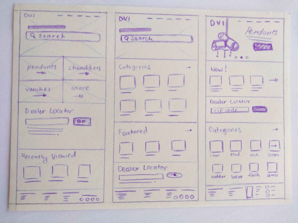
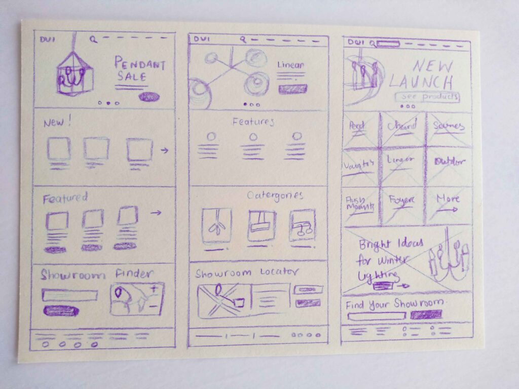
Low-Fidelity Wireframes
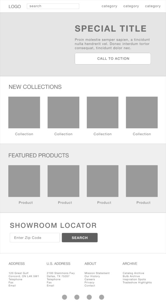
Out of the iterations, we decided upon the most promising designs for the low-fidelity wireframes. We kept the navigation options flexible as this was the area that seemed to be causing the most trouble for users.
Moodboard
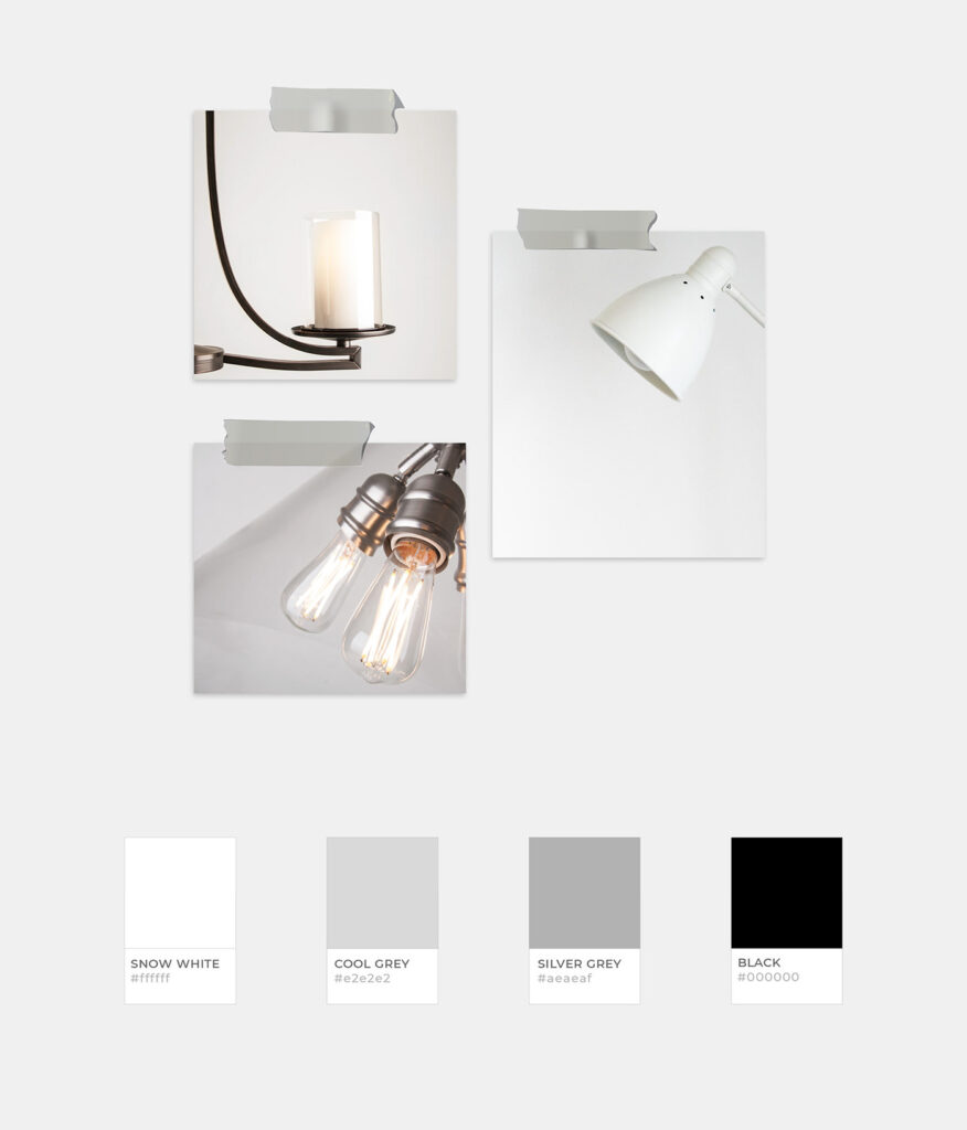
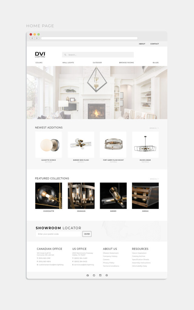
The visual look-and-feel of the site was refined multiple times with various iterations and multiple meetings. Most of the design team was on the same page about the visual aesthetic: something minimal yet classic, monochrome with limited colours. Any colours would simply be used as accents to keep it neutral and understated. We experimented with various typefaces, colour palettes, and spacing until we found a visual style we were happy with.
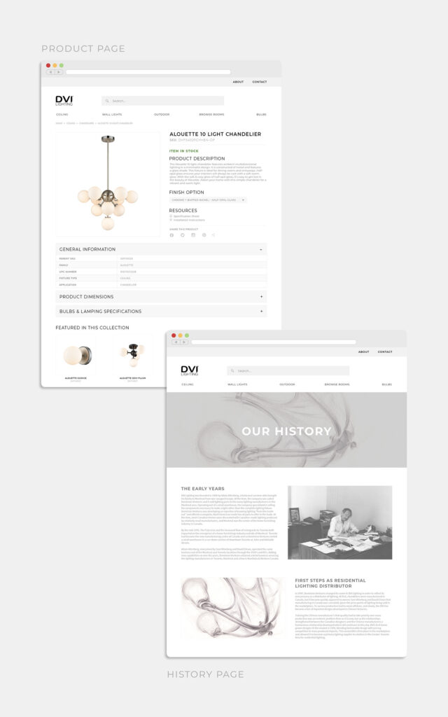
High-Fidelity Wireframes
Once we had build a high-fidelity mockup, it was at this stage that management wanted to provide input. Certain requirements were made: each product page must contain all technical product data, the dealer locator must be floating and following the user on each page, titles must follow a certain format, certain links must be included in the top-most navigation, etc). The dramatic increase in textual information on the product pages influenced future mockups of the site.
Testing & Validation
Usability Testing
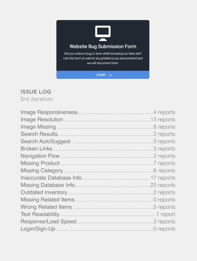
Our wireframe components and visual theme were implemented by the developer. The skeletal site was populated with a subset of actual product data to see how well it could manage product information. We created subdomains to test our different versions, preferring only to migrate our established decisions onto the final development site that was scheduled for deployment. This allowed our candidate site to remain clean and minimal while we sorted out our testing issues on our various subdomains. Users were encouraged to fill out a feedback form to log any issues or problems they encountered when using the site. This process was continued whenever any major changes were added to the staging site.
Tree Testing
As navigation had been a serious issue in the previous versions of the site, we tested users on what paths they took to reach a particular part of the site. Tree testing was facilitated with Tree Jack in a limited capacity due to budget constraints.
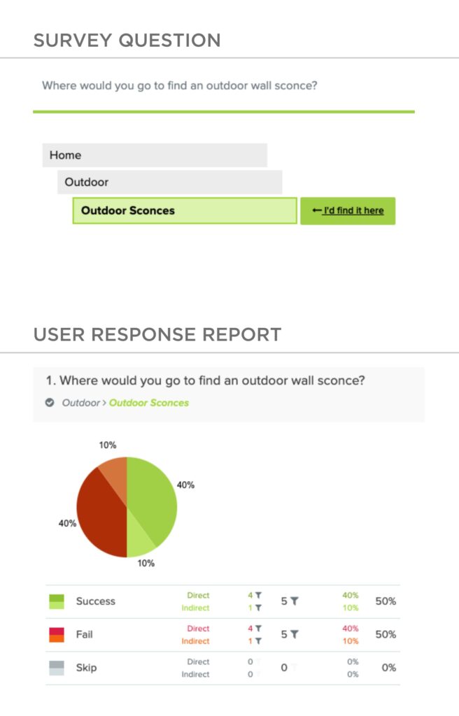
Based on the questions that displayed a significant fail rate, we were able to look under the hood to see where the users were getting tripped up. In the case of this survey question, it become obvious that certain users were confused about indoor sconces vs outdoor sconces, as they are located in different parts of the navigation tree.
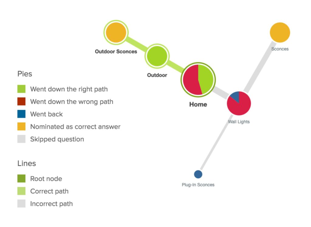
Watching the user’s path in real time was invaluable resource in planning and making navigation-related decisions. For the above problem, we nominated changing the indoor sconce category to be clearly marked as “Indoor Sconces” rather than simply “Sconces” to avoid confusion with its outdoor counterpart. Preserving the distinction between indoor and outdoor wall sconces as separate categories was important to the company as outdoor lighting regulations require the latter to made from different climate-resistant materials. This is why we decided not to combine them in the end.
Retrospective
Looking back at this project, there are a couple things that could have been done differently.
There was a lack of objectivity with regards to certain in-house users. It’s one thing to implement something because 50% of the user base wants it, it’s another thing to implement it because one of the users has an office right beside you and periodically comes in to ask you if you are going to implement that suggestion they made or not.
The other main issue was that the website served as a temporary fix over the much larger data storage and accuracy information. There was no central and accurate database available for the users; rather there was a series of various tables of product data that didn’t always contain a complete list of products or accurate fields. Until this issue was resolved, the website was always going to be a compromise.
Our budget and time constraints also effected the eventual outcome. In an ideal world, I would have liked to add:
-
Custom search filters
-
A separate section for lightbulb products
-
A Related Items section based on what customers frequently bought together rather than collection groupings
Accessing accurate and reliable data was crucial. The site needed to include the latest collection of available product and provide resources such as technical specification sheets, assembly instructions, and physical dimensions for the diverse groups of users who needed it for their projects.
By revamping the site, the design team and I hoped to vastly improve the online experience for all users.
